Year

2025

Services

Visual Identity

Motion Design

Thuisfront Festival: Turning the colours of uilenstede into one shared identity.

Thuisfront Festival: Turning the colours of uilenstede into one shared identity.

Thuisfront Festival: Turning the colours of uilenstede into one shared identity.

Uilenstede is home to thousands of students, spread across a group of tall residential flats, each with its own name and character. Thuisfront Festival brings them together for one day, with local music, DJ talent, art and much more.

The name says it best: thuisfront means home front. This is an event built around feeling at home.


Colours from Uilenstede

Colours from Uilenstede

Colours from Uilenstede

Opening visual for Thuisfront Festival 2025, showing the colourful block-based identity system.
Thuisfront Festival colour palette artwork based on the Uilenstede flats.
Motion design still for Thuisfront Festival with floating gradient blocks and festival typography.
Thuisfront Festival campaign asset combining event photography, typography and colourful 3D shapes.
Thuisfront Festival identity artwork with layered gradient blocks and poster graphics.
Graphic layout showing how the Thuisfront Festival visual language is applied across campaign moments.

A local palette inspired by the Uilenstede flats.
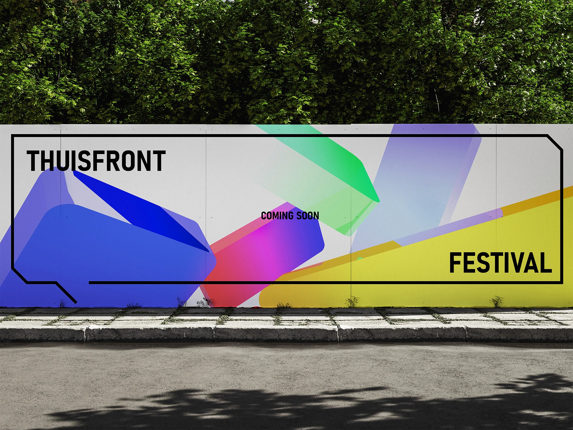
Outdoor Thuisfront Festival wall graphic installed at Uilenstede.
Two Thuisfront Festival social graphics: an artist announcement and a dated festival poster.

The flats as the heart of the identity

The flats as the heart of the identity

The flats as the heart of the identity

We made the flats themselves the heart of the festival identity. The logo and every visual translation return to one recognisable shape: the flat as a symbol of the community living inside it.

From there, we built a colour system based on Uilenstede’s six flats: yellow, red, blue, red and blue, green, and dark blue. Every resident can recognise their own building in the identity, making the festival feel personal rather than generic.
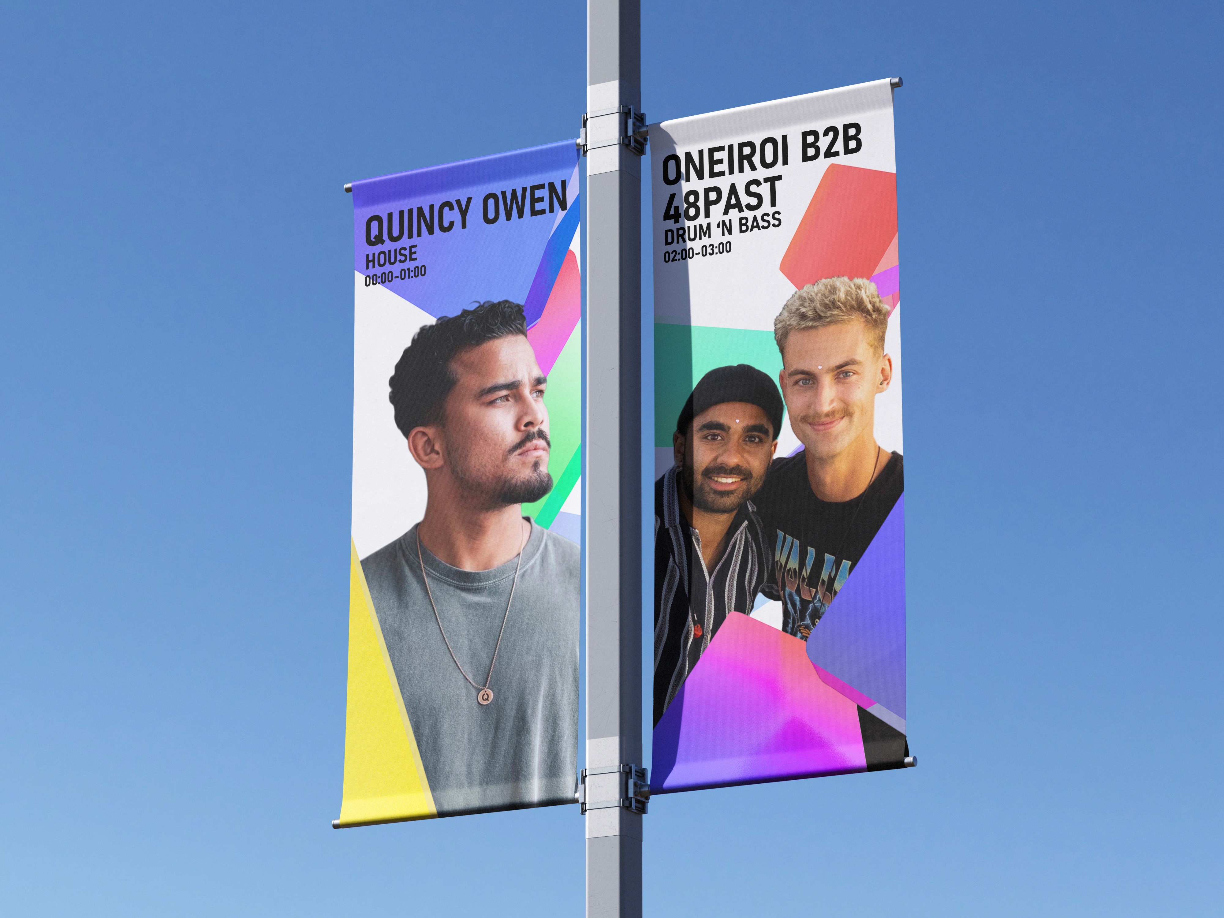
Festival flags on a pole using Thuisfront campaign artwork against a blue sky.
Thuisfront Festival save-the-date graphic with large typography and colourful background shapes.
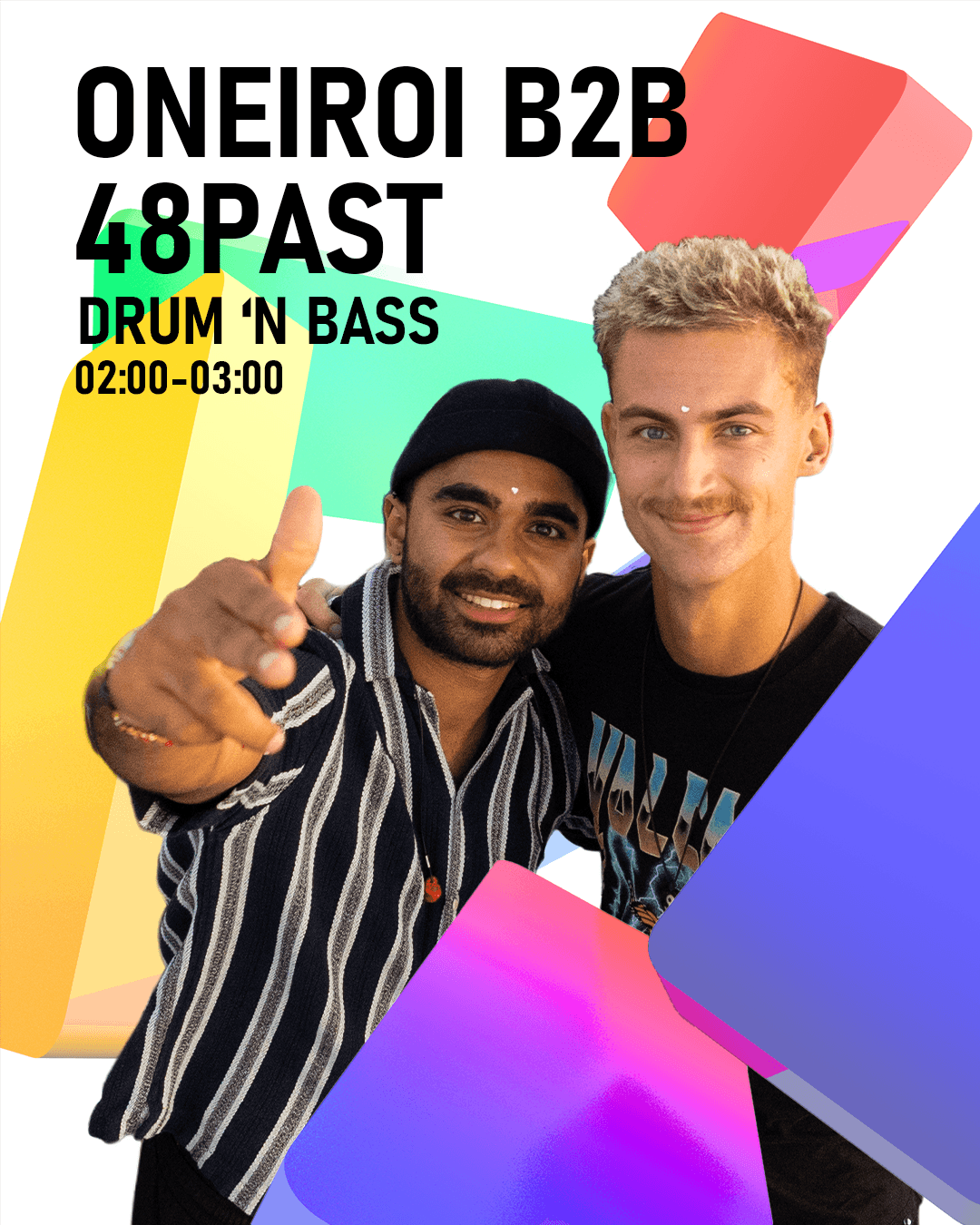
Artist announcement graphic for Quincy Owen using the Thuisfront Festival identity system.
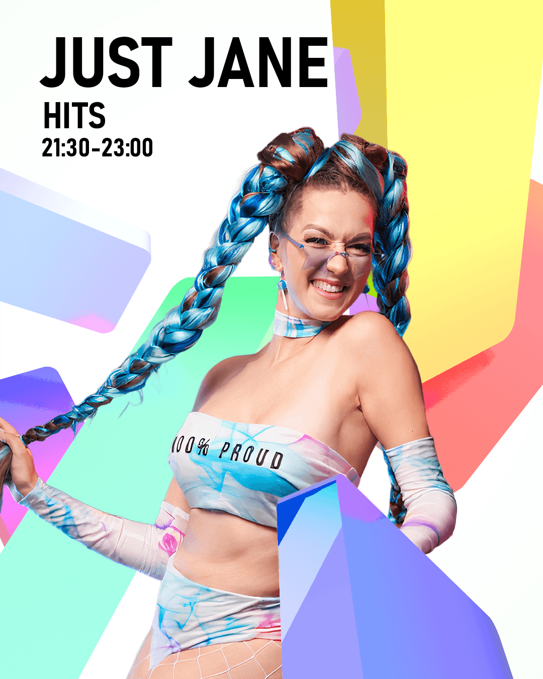
Artist announcement graphic for Just Jane with Thuisfront Festival typography and colour shapes.

A flexible logo system for one shared community

A flexible logo system for one shared community

A flexible logo system for one shared community

The real idea comes to life in the way those colours behave. During the festival, residents from every flat come together in one place. So in the visual style, the colourful flats blend and mix into each other.

It is a small design decision that carries the whole message: separate towers, one community.

The result is a visual identity that feels playful, warm and genuinely inclusive, matching the open and festive spirit of the day itself.


Ticket sale start graphic for Thuisfront Festival with date and bold framed typography.
Black-background mockup of Thuisfront Festival wristbands with gradient bands and typography.
Thuisfront Festival custom wordmark construction with coloured anchor points.
Thuisfront Festival logo design process showing the TF monogram, gradient background and letterform details.
Printed Thuisfront Festival applications including posters, signage and folded programme material.
Hover to reveal